Building off the limitations of the text syllabus, Nilson provides a brief literature review to make her case about how and why graphics enhance learning. Concept maps and mind maps have been studied and proven to be effective for students of different learning styles, encourage engagement, increase learning and retention, and show big picture concepts. Because visuals are being used increasingly in the classroom, Nilson argues that they can be equally effective and pedagogically power if integrated into syllabi.
Next, she discusses how to go about designing a graphic syllabus:
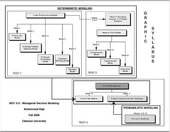
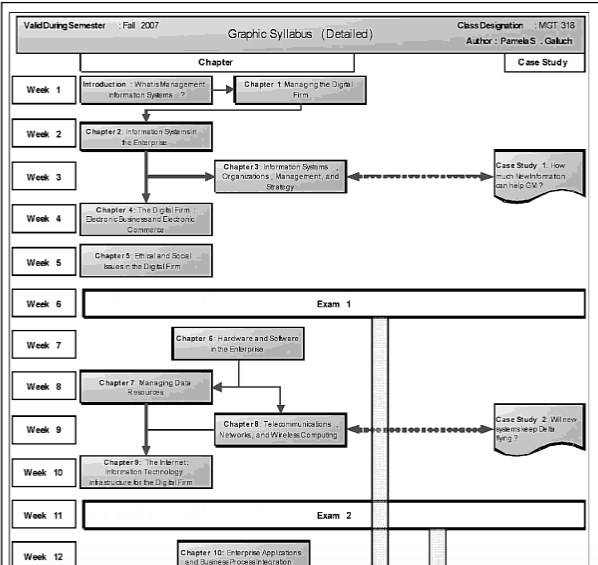
a flowchart or diagram that displays the sequencing and organization of major course topics through the semester…uses spatial arrangement, connecting lines, arrows, and sometimes numbers to show the logical, temporal progression of the course through topics within the subject matter…t may—but need not – use icons, pictures, and visual metaphors to convey the meaning of words, concepts, and relationships (26)
Instead of providing codified design suggestions, Nilson provides different organizational design strategies such as competition and complimentary, parallelism, process, sequence/chronology, categorical hierarchy, while also providing an abundance of examples of graphic syllabi.
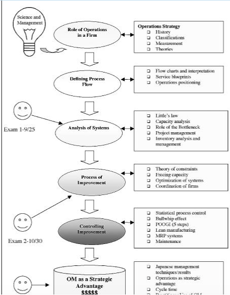
In a similar manner, Nilson’s discussion of charting outcomes focuses on choosing the best organization method to be represented visually. Situated by studies from Perry, Baxter Magolda, and Fink, Nilson uses cognitive theories of development and learning to define and discuss three types of objectives as a method for visual organization: ultimate objectives (end of semester goals), mediating objectives (what your students need to perform to get to the ultimate objectives), and foundational objectives (low order cognitive skills) (64-65). The outcome map then serves both students and teachers as “a visual tool to conceptualizer and move the process along” (86).